
Foundry College | Visual and Product Design
This page includes a gallery of components, guidelines, and I created for Foundry College, a startup online educational program with a proprietary platform. As part of my role as Course Design Assistant and later Product Designer, I:
re-designed the lesson editor
led design for a student data dashboard
oversaw daily QA meetings
demonstrated the webapp product to prospective partners, playing a key front-facing role in business development efforts.
Course Designer
(Re-design project)
The “Designer” is a lesson planner that is a companion to proprietary classroom software. It is a tool that integrates existing slide decks with engaging in-class activities. Instructors and Course Designers can use it to pre-set a lesson, which will in turn reduce the cognitive load on the instructor when managing multiple activities during a live, remote class.

Overview
Product. Home-built lesson planning platform that integrates Powerpoint files and Google Slides with in-class activities, such as polls and small group activities. Connected to the proprietary class platform.
Purpose. Teaching online requires much cognitive load for instructors. Screen-sharing a simple presentation does not provide an active and engaging way for students to learn. Being able to set up activities beforehand allows the instructor to focus on content rather than technology (screen-sharing, setting up polls, and sorting students into groups). The updates to this editor were made to improve workflow and error prevention.
My Role. Lead visual and component style; co-lead UX design.
Audience. Instructional Designers, Course Assistants, Instructors
Problem. The system needed a high level of internal knowledge to operate. The flow of the app made it difficult to scan for errors. The Breakout Activity setup included a lot of customization options but created a long form that was slow to review.
Process. Created ideal workflows page-by-page and updated the look. This project also kicked off the creation of new UI components for the company design system.
Original Editor

Re-Design


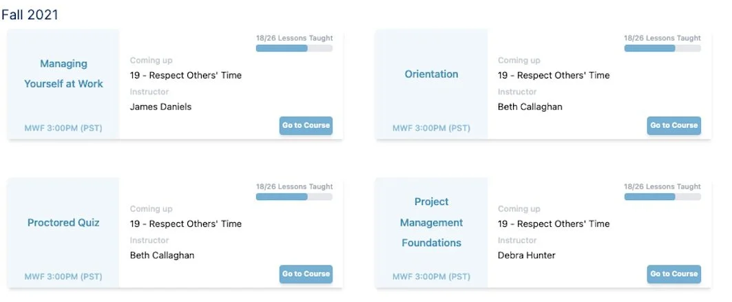
Course Cards for a Reporting Dashboard
Task. Re-design course cards for an educational company’s reporting dashboard.
My Role. I was the lead visual designer for this component. I reviewed ideas and critiques with my team (3 engineers, 2 designers including me) and incorporated feedback.
Brand Identity. Professional and modern program to upskill working adults. Colors include dark blue, light blue, and orange accent.
Audience. Administrators, Instructors, and Internal Personnel.
Purpose. Show top-level data for a course and act as a button to drill down into further details. Required elements include the course name, weekly schedule, and enrollment number. Any other information is nice-to-have.
Original Card, Critiques,
and Explorations
The original card design has a few flaws in hierarchy and color selection.
Though the light blue color is one of the brand colors, it is meant to be an accent. The color on its own looks a bit dated, and it also does not pass accessibility tests with white.
The course title should be the highest in the visual hierarchy. The medium-weight black text stands out more than the title, even though it is tertiary information.
Though a go-to-course button is easily readable, tests with administrators suggested that they try to click on the course title and prefer a larger target.
All cards had the same style, which made it difficult to scan for the correct course.
To improve the hierarchy, I worked to add variety to the cards, adjusted the title contrast, and made the entire card the clickable target.


Breakdown of the Final Card

In most cases, the administrators would treat this card as a button to navigate to specific data, making the course title the most important element in the hierarchy. I achieved this hierarchy through:
The contrast between the dark color and white
Text size and font-weight
A drop shadow to the text, which acts as a subtle outline to maintain readability on all card colors
The height of the title area, which provides breathing room and enough space for course titles that may span 3 lines
