Mobile Ordering A/B Test
The goal of this project was to re-design the experience of Kahuna, where you can build your own poke bowl. The in-person experience at this restaurant is clear, and I hoped to mirror the mobile user experience with ordering in-person. Specifically, I set up a possible A/B test for the experience of adding extra items – whether at the end of the flow or within each category.
In the end, I did a round of heuristic testing of the two flows.
Insights from the restaurant’s current experience
The in-person experience is clear and linear, with ample signage to indicate what different unfamiliar food items are.
The mobile or desktop experience allows the user to continue without specifying any bowl ingredients. Its hierarchy could use improvement, including adding category titles. Extras are in an “Add On” section at the end, and all items are in one long list without chunking.
I aimed to improve these elements, and focus on the placement of “Add Ons” for my UX test.
Interactive Prototypes |
Final Result
Feel free to click through Flow 1 and Flow 2 to the left. Participants were told to order a regular-size poke bowl with
white rice;
2 portions of tuna;
ponzu;
edamame, seaweed, jalapeño, pineapple;
crab salad, furikake, cilantro;
2 portions of garlic chips;
and Kahuna sauce and Spicy Mayo (extra flavors).
Note: Both flows are only wired for a specific task flow, so the prototype is not fully connected. Keep this in mind as you click around!
Task Flows
Wireframes
Setting up the System
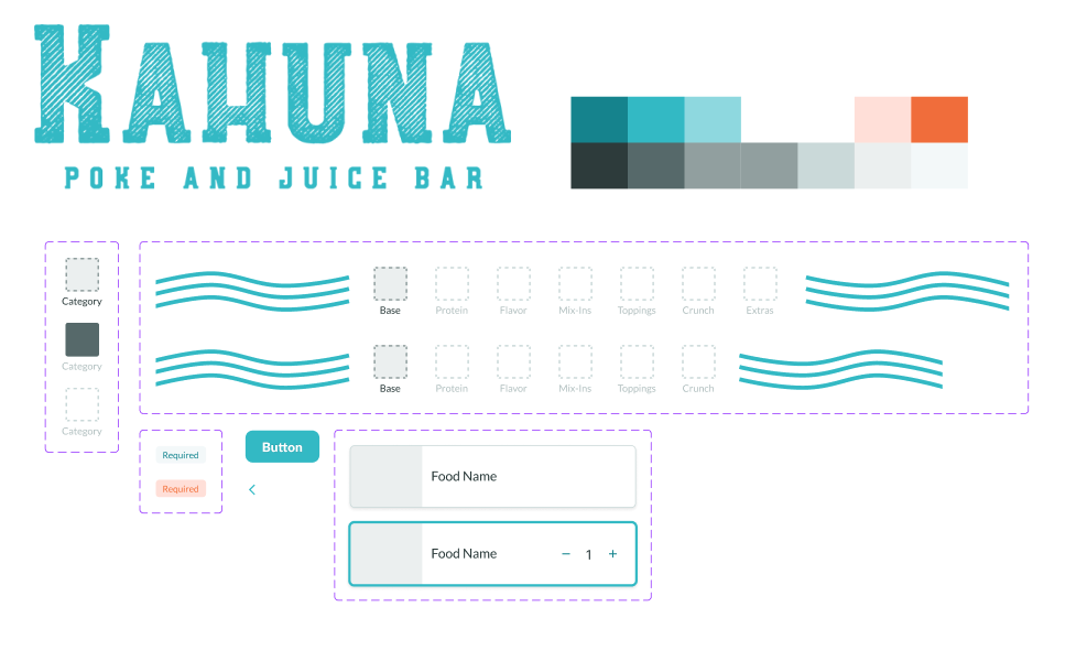
To speed up the prototyping process, I created predicted components in Figma and collected assets for the visual system.
Takeaways
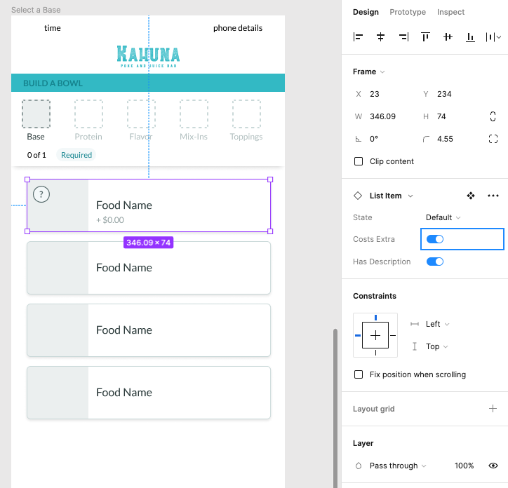
I observed three separate participants as they worked through each flow. Reception to the AB selection experience was fairly positive. It was noted that having both approaches mixed into one might be good to test to give different types of users their preferred mode of thinking through the food items. It was also noted that having a clear review screen before adding to the cart at the end is desirable. Users responded positively to the tool-tip popup, particularly for this restaurant which had some items the users did not recognize.
This project helped me grow in the early planning phase of a project. Reviewing what exists and reverse-engineering task flows allowed me to see at a glance the many choices we face at any point in the digital space.

